Workflow Automation (WIP)
Improving an internal design briefing workflow by transforming complex stakeholder requirements into a clear, user-centred experience.
Role
UX Lead (Initiative-led project alongside my Graphic Designer role)
Industry
Internal team - Public Sector
Duration
March 2026 - Present

As part of Christchurch City Council's organisation-wide Modernisation Programme, our Design Team's briefing system was migrated from old platform to SharePoint using Nintex Forms.
The migration introduced significant usability issues. Internal staff experienced a more complicated submission process, while our Design Team struggled to communicate on time or efficiently with clients without the automated emails we had.
I recognised this as a user experience problem rather than simply a technical issue. I proactively proposed leading the discovery and workflow design to help align stakeholders and improve the future experience.
Research & Discovery
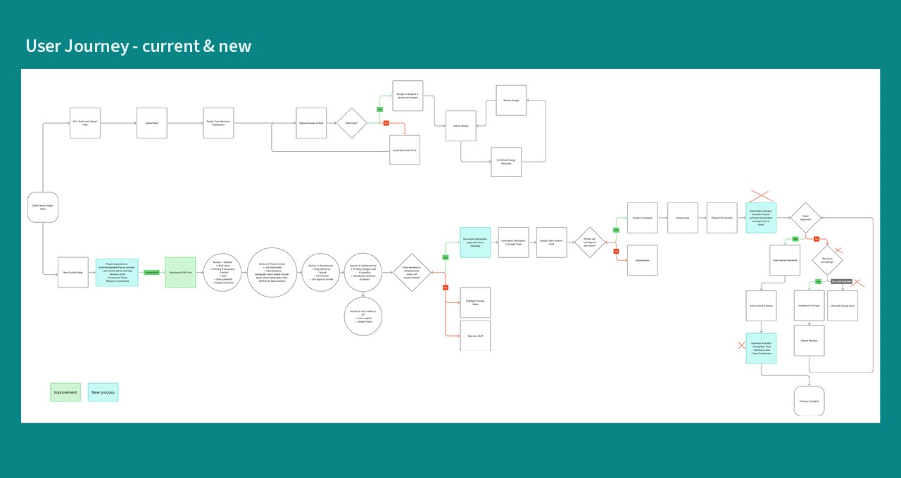
I started with understanding the entire workflow, and documented three separate journeys:
01 Existing workflow
How the original briefing process worked before the system migration.
02 Current workflow
How the new SharePoint/Nintex process behaved after migration.
This helped identify:
duplicated actions
unnecessary complexity
broken interactions
inconsistent system behaviour
03 Future Workflow
A simplified end-to-end experience representing how the process should ideally work for both requesters and the Design Team.
Journey Mapping and Hi-fi Design
I translated a complex workflow into a clear visual representation showing:
user actions
system responses
decision points
pain points
opportunities
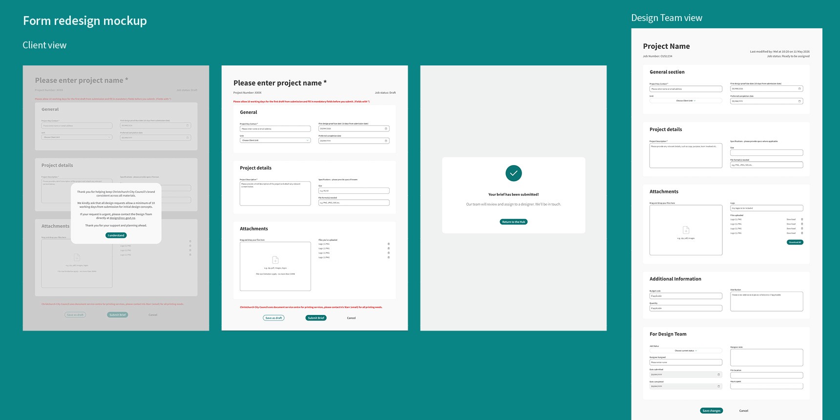
I also created a high-fidelity design of the future briefing form in Figma. It served as a communication tool that allowed developers and stakeholders to visualise exactly how the future workflow should function.
Prioritising by user impact
Rather than requesting every improvement simultaneously, features were grouped according to urgency and business impact.
Priority 1
Critical system failures
Email notifications not being sent after form submission
Priority 2
Workflow improvements
Simplifying the form
Removing duplicated fields
Improving information hierarchy
Priority 3
Future enhancements
Additional usability improvements identified during journey mapping.
Early Impact
While the redesigned workflow has not yet been released, several positive outcomes have already been observed.
✔ Improved stakeholder alignment
✔ Faster understanding of project requirements
✔ Reduced reliance on lengthy meetings
✔ Clearer feature prioritisation
✔ Stronger collaboration between Design, Digital Channels and Development teams
Most importantly, the project transformed a complex collection of verbal requests into a shared visual roadmap that everyone could understand.
Current Status
Work in Progress.
The development team is currently implementing the highest-priority issues, beginning with restoring critical email notifications before moving on to improvements.
Reflection
This project reinforced an important lesson for me: good UX is not only about designing interfaces - it is about creating clarity.
By visualising workflows, user journeys and future-state concepts, I was able to transform a complex collection of verbal requirements into a shared understanding across multiple teams.
Although implementation is still in progress, this experience demonstrated how UX methods can create value long before a product is built.
Other projects

Campgrounds Website Redesign (WIP)
Creating a unified yet distinctive visual identity for four Christchurch City Council campground websites.

He Puna Taimoana
Led the redesign of the He Puna Taimoana website, improving usability, accessibility, and mobile-first experience.

Motion UI Accessibility
Led Motion UI accessibility research, defining principles, introduce Motion UI System and improving micro-interactions across council digital platforms.

Water Quality Map - Wai Map
Redesigned interactive water quality maps, enhancing usability and clarity for public and internal teams.

What’s on UI
Redesigned the What’s On app onboarding and introduced a seasonal UI across mobile and desktop.